
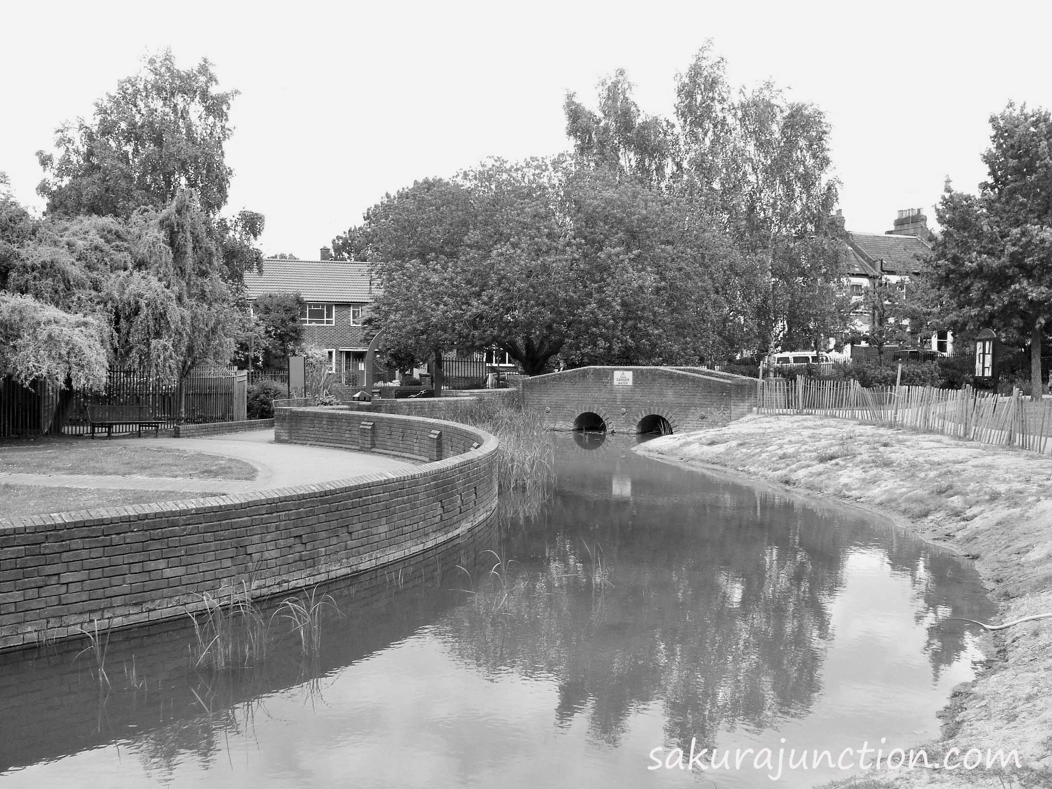
Day 3 on “Photo 101” – ‘WATER & Orientation’
I went out to take some photos today by thinking I might get a great shot at a nearby reservoir. But the reservoir was almost empty and it was hardly a picturesque place unfortunately. So I moved on to a park which has some water feature with a small waterfall and … I saw it was a water feature without water … Aaaaah. However, I found this canal area was rather interesting. Lots of curves gathered including a blue entrance gate to the park as the background.
And for Today’s question ‘Horizontal vs Vertical’ I definitely chose horizontal for this spot because more curves can fit in to a frame. However, my question was ‘Colour vs B&W’.

With such a nice reflection , color is by far better to my eyes.. you post was in reader, so you did it right. List Photo101 as one word in tags and you’re good.
LikeLiked by 1 person
Really? My post is in the Reader? Why can’t I see it then?? Anyway, thank you for the great comment.
LikeLike
The link was there. That’s how I found you. I may have misunderstood. I meant you posted the link properly
LikeLike
Color is better for this I think . But I like them both.
LikeLiked by 1 person
Thanks for giving me your opinion. I think you’re right. Some people said Colour is better. Cheers!
LikeLiked by 1 person
I actually think that black and white works better for me. It’s creating more of a mood, telling a story better. I like the way your eye is drawn to the curves. Nice shot 🙂
LikeLiked by 1 person
Oh, thanks Mel for your opinion. You see, even the plants in water are creating curves. I think if I could’ve created more contrast, the B&W probably looked much better.
LikeLike